My first week at Metis could certainly be described as a whirlwind. Making use of all the angst and excitement that come with using new skills, I eagerly dove into our first project. We used Python, Pandas, Seaborn, and more to perform an exploratory data analysis, always keeping our framing questions in mind.
Framing the Project
The premise of the project that we were approached by a (fictitious) client: WomenTechWomenYes (WTWY). Our clients provided us with the following information:
As we mentioned, we are interested in harnessing the power of data and analytics to optimize the effectiveness of our street team work, which is a significant portion of our fundraising efforts.
WomenTechWomenYes (WTWY) has an annual gala at the beginning of the summer each year. As we are new and inclusive organization, we try to do double duty with the gala both to fill our event space with individuals passionate about increasing the participation of women in technology, and to concurrently build awareness and reach.
To this end we place street teams at entrances to subway stations. The street teams collect email addresses and those who sign up are sent free tickets to our gala.
Where we’d like to solicit your engagement is to use MTA subway data, which as I’m sure you know is available freely from the city, to help us optimize the placement of our street teams, such that we can gather the most signatures, ideally from those who will attend the gala and contribute to our cause.
I’ve added some emphasis in bold. These phrases helped us to frame our project and to design a pipeline which would best address our client’s needs.
Primary Goal: To effectively place WTWY’s street team in order to…
So where should we put the street team?!
Primary Goal: To effectively place WTWY’s street team in order to…
- Maximize attendance (“build awareness and reach,” “gather the most signatures”)
- Target attendees who will…
- Be interested in the mission of WTWY (“will attend the gala,” “passionate about increasing the participation of women in technology”)
- Contribute to the cause (“fundraising efforts,” “contribute to our cause”)
- Be interested in the mission of WTWY (“will attend the gala,” “passionate about increasing the participation of women in technology”)
So where should we put the street team?!
Designing our Approach
First, we had to make a few assumptions:
- Prioritizing the highest traffic subway stations would maximize the number of emails collected
- We pulled data from May 2019, assuming that:
- These data would be similar to May 2020 and
- WTWY will be collecting emails a month before the gala date, which we decided would be in June 2020
- People in the demographics we choose to target are, in fact, people who are interested in WTWY and its mission.
- There are a whole lot of interesting ways to combine entry and exit data. Since we chose to prioritize sheer volume rather than patterns of traffic, we assumed that entry counts were a sufficient data source for our purposes.
Given the client’s goals and these assumptions, we chose to focus on finding most trafficked stations using MTA turnstiles data and to look at demographics using data from ZipAtlas.
Data Process and Pipeline
We followed this process for the datasets we used.
MTA turnstile data is collected at every NYC subway station every four hours and for every turnstile. The data are available online, making it easy for anyone who is interested to check them out (acquire). After we acquired these data, we needed to clean them; this included getting rid of white space in column names, dropping entries where the turnstile counter malfunctioned, and, most importantly, making sure we could actually use the entry tallies (transform). Apparently, these turnstiles had been cumulatively tallying up entries (since… the beginning of time?), and we needed to create a new column with daily counts in order to use these data in a meaningful way.
Data used for demographics was primarily from ZipAtlas, which provides the following metrics;
- Percent of females in the labor force by zip code (likely interested in WTWY’s values)
- Percent of people who take public transit by zip code (likely to be using the subway)
- Percent of people in professional and scientific jobs by zip code (likely interested in WTWY’s values)
- Percent of households with an income over $100k per zip code (able to donate)
- Population (likely to attend, since they live in NYC)
So now that we had all the data figured out, what did we learn from it?
Exploration and Analysis
Maximizing Volume of Potential Attendees
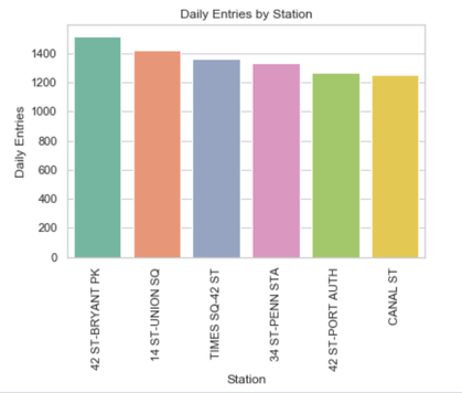
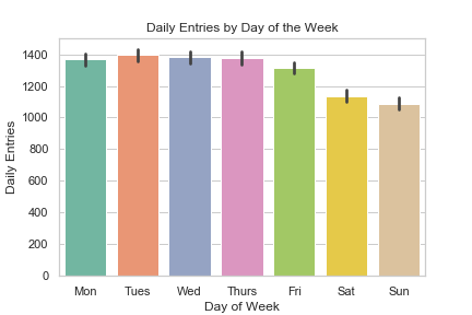
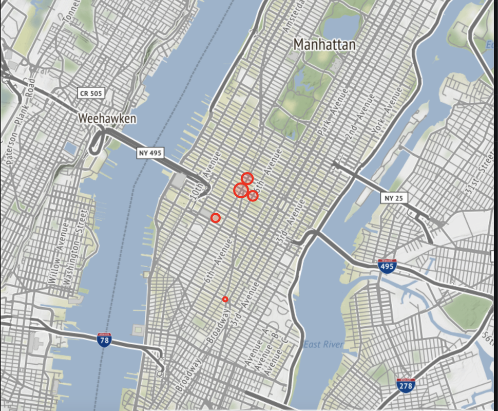
First, we found that the most stations trafficked most on a daily basis (on average), were 42nd St Bryant Park, 14th St- Union Square, Times Sq- 42nd St, 34th St- Penn Station, 42nd St- Port Authority, and Canal Street. Ok, great. So are these stations more trafficked on any particular day of the week?
It looks like these stations get more traffic on the weekdays, a trend which held for all of the stations.
These stations look pretty much the same for entries in the morning and exits in the evening, so it looks like commuters are probably frequently using these stations (and, likely, ones from outside of NYC).
These stations look pretty much the same for entries in the morning and exits in the evening, so it looks like commuters are probably frequently using these stations (and, likely, ones from outside of NYC).
Okay, great. We can tell WTWY to station their crews at these stations during the week. But at what times would they catch the most people?
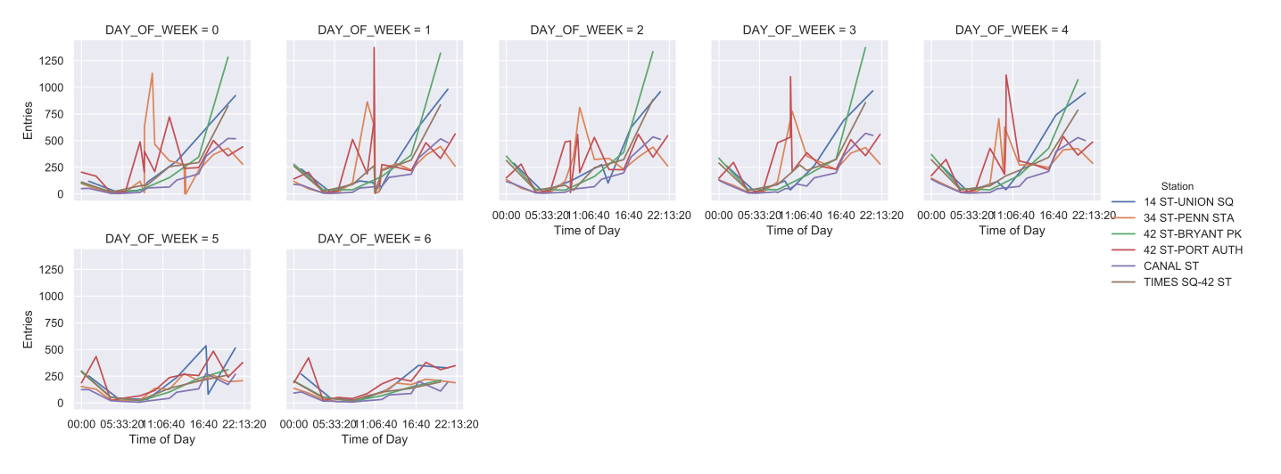
Here are entries for each day of the week (0 = Monday and so on). Note: though these lines look continuous, the data were only gathered every four hours, so they’re not. Still, this is a great visual way to represent some of what is going on at these stations. We can see that Port Authority and Penn Station seem to spike earlier in the day on weekdays (when people head to work) while Bryant Park and Union Square spike later in the day (perhaps as people are headed home).
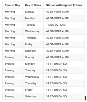
Given our data, here is a time schedule we’d recommend:
Prioritizing Demographics of Potential Attendees
We pulled data for five metrics from ZipAtlas-- females in the laborforce, taking public transit, having professional or scientific jobs, household income over $100k, and population-- but is each of these metrics equally important for our analysis?
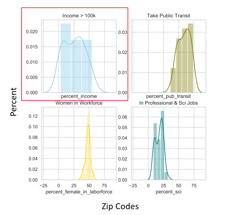
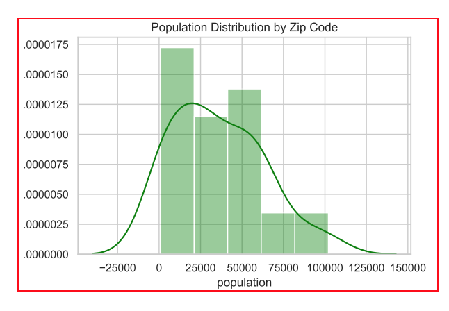
To find this out, we plotted out histograms of these data by zip code:
To find this out, we plotted out histograms of these data by zip code:
As you can see, the two metrics -- household income over $100k and population-- have far more variance. What does this mean practically? Well, if WTWY prioritizes stations in zip codes with relatively high populations of females in the laborforce, populations frequenting those stations are still pretty similar to stations in zip codes with relatively low populations of females in the workforce. In other words, the data is pretty homogeneous. However, there’s a bigger difference in demographics between a station in a zip code with relatively high rates of household income over $100k and a station that is relatively low on that metric. Put simply: WTWY gets more bang for its buck, and probably hits its target groups more effectively, by focusing on stations in zip codes with relatively high rates of household income over $100k and higher populations.
A word about why population is important here: just because a station is highly trafficked (as are the ones mentioned above), this doesn’t mean it’s trafficked by the kind of people you want to target. In this case, the most trafficked stations are in areas that 1) have a lot of tourists and 2) have train lines, so a lot of people are commuting in from Connecticut and New Jersey to go to work and entering the subway (as opposed to exiting) at these stations. These people may be less likely to come into the city for a gala. This is an argument to use population as a metric, hopefully targeting people who actually live in the city and might be more likely to attend a gala.
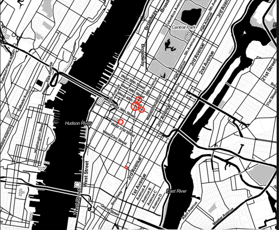
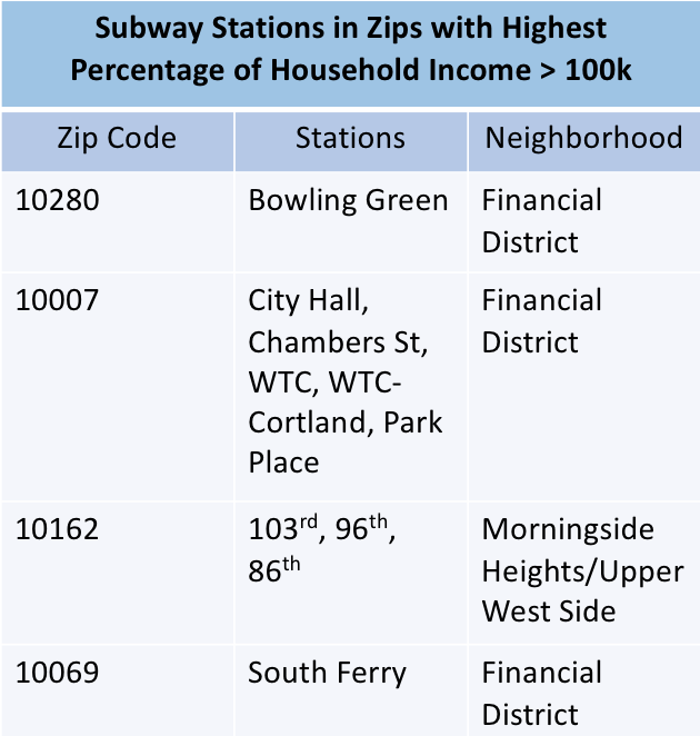
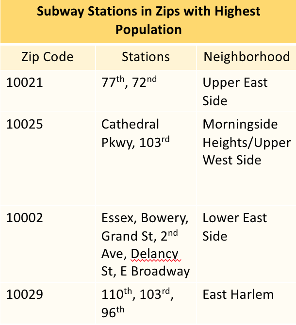
Here are the stations highest on the metrics of household income over $100k and population:
Based on these data, and cross-referencing these stations with entry data (by looking at percentile), as well as making sure that these stations represent neighborhoods that have favorable demographics, the following stations are all around good bets:
- Grand St
- 103 St
- 72nd St
- 96th St
- 2nd Ave
- 86th St
Conclusions & Recommendations
Given our analyses, we can draw the following conclusions and make the following recommendations to WTWY:
Conclusions:
Volume:
Demographics:
Recommendations:
Volume:
If WTWY chooses to prioritize getting to the most people, they should put their crews at the six subway stations listed above at the times recommended.
Demographics:
If WTWY chooses to forego reaching quite as many people, but, rather to reach people who are likely New Yorkers and who likely have the means to donate, they should prioritize the six stations recommended above.
Conclusions:
Volume:
- The most trafficked stations seem to be in commuter areas.
- Travel on the weekdays is relatively comparable; travel on weekends is relatively low.
- The busiest times are when people are coming to and leaving from work.
Demographics:
- Stationing street teams at subway stations is probably an effective way to target people with household incomes over $100k, who are more likely to donate, and to target people who actually live in NYC, and, therefore, might be more likely to attend.
- There might be better ways to target women and tech workers, whose values would likely align with WTWY’s values, than stationing street teams at subway stations, given the relative demographic homogeneity across the city. And hey, WTWY, we’re happy to analyze some other data to figure out how to reach them! You know how to find us.
Recommendations:
Volume:
If WTWY chooses to prioritize getting to the most people, they should put their crews at the six subway stations listed above at the times recommended.
Demographics:
If WTWY chooses to forego reaching quite as many people, but, rather to reach people who are likely New Yorkers and who likely have the means to donate, they should prioritize the six stations recommended above.
*Icon attributions: people by Wilson Joseph from the Noun Project- Demographic Data by H Alberto Gongora from the Noun Project

 RSS Feed
