RITA BIAGIOLI
  • About
  • Resume
  • Portfolio
  • Blog
  • Contact

And now... a video!

5/7/2020

0 Comments

 
 Exciting news:  you can now listen to talk about my latest project -- What Products Bring Us Joy?-- on YouTube!
​

Stay tuned for more data science projects to come! I have a few ideas I'm playing with.
0 Comments

What Products Bring Us Joy?

4/6/2020

0 Comments

 
Consumerism, in general, fascinates me. I'm always curious how people engage with products and the emotional valence behind those interactions. What about an object makes us actually feel something? Why and how is this important?

There's a lot of recent research indicating that we get more long-term joy out of experiences than we do from objects. At the same time, Marie Kondo has been wildly popular as of late, and her insinuation is that some objects do in fact spark joy. Not all of them, of course, but there are certainly some objects that we want to keep around. Ingrid Fetell Lee has a blog and recently wrote a popular book detailing characteristics of objects that bring us joy, such as color and shape. 

Given this contrast, how can we better understand what products actually do cause joy rather than (or even, perhaps, in addition to) gather dust?
Picture

Data and Process

In order to address these questions, I analyzed 450 thousand Amazon product reviews. Tools I used included:
  • Postgresql, SQL Alchemy to store and access data
  • Tone analysis using the NRC Emotion Lexicon
    • It was really important to me to use a crowdsourced lexicon since writers of reviews are a similar population and, thus, meanings of words from the two sources would be more likely to align
  • Feature engineering and principal component analysis (PCA) to extract/condense the most important features
  • Clustering (k-means)
  • Time series analysis using Facebook Prophet

Through using tone analysis, I was able to label each review with a score for joyfulness as well as for several other emotional metrics. 

I chose k-means clustering because this method made the most sense of my data. I came up with 8 clusters because this number both minimized inertia and was interpretable.
​

What Categories of Products Bring Happiness?

I was able to isolate a few categories wherein the reviews had higher joy ratings on average and a few categories that had lower joy ratings on average: 
Picture
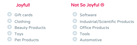
How might we interpret this? The more joyful categories are actually products that tend to be more experiential while the less joyful categories are more practical or functional. This aligns nicely with prevailing research about experiences bringing more long-term joy than possessions.
 

Relationship Between Star Rating and Joy

Ok, great. But-- I bet you're wondering about the one to five star rating that reviewers give a product.

Interestingly enough, there is...
Picture
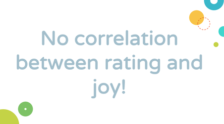
What this might mean is that joy is actually a separate metric from star rating. It's pretty common to use star rating as a measure of customer satisfaction, and it is, but this analysis would indicate that it is not the only viable or interesting measure.

​So what's the difference between them? Let's look at four categories:
Picture
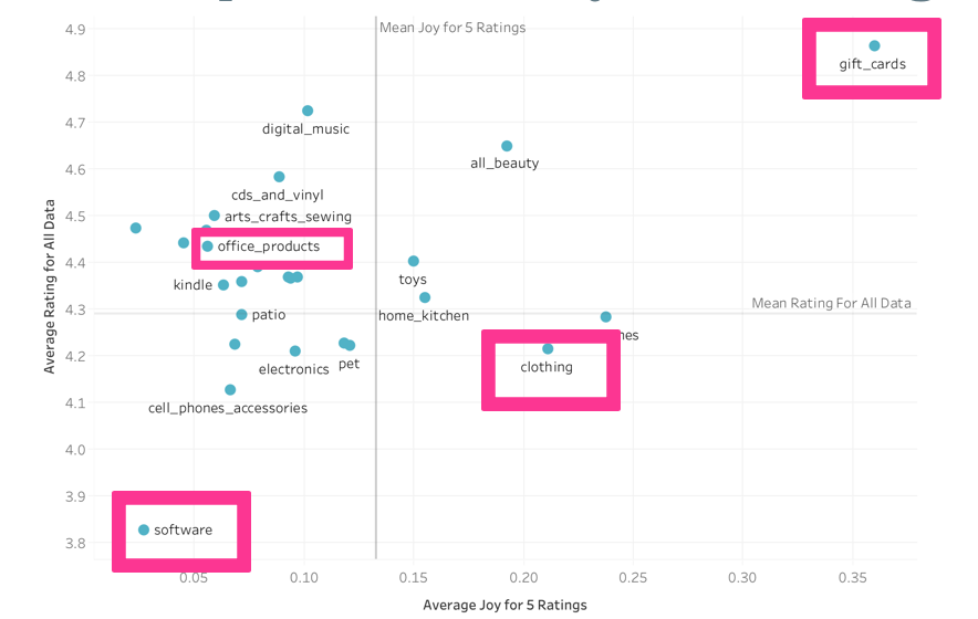
In this figure, average rating for all data is on the y axis and average joy score for ratings with five stars is on the x axis. (As indicated by the lack of correlation, categories had similar average joy scores regardless of rating).

​First let’s start with gift cards— they’re high on both average joy and average rating. What I think this means is that people enjoy the experience of giving, the act of it, but also, they know exactly what the product is— their expectations are met, which I think is what the rating reflects.

Office products are relatively high on rating, but low on joy, illustrating that people are getting the function they expect (hence the rating), but they might not be optimizing for the experience.

For clothing, people are very joyful, probably because they get to wear something new and experience the item very viscerally, but the ratings are a bit low— we often order clothing items and they’re not really what we expected them to be (or at least that often happens to me!).

And finally, software is low on joy and on rating, which means that the software might not be exactly what we expected and, also, we are not enjoying the experience of using it too much.

So we’ve examined joy by category, but taking category out of the equation, how can we group products agnostic of category and, then, how can we see which products are joyful?
​

What Products Bring Happiness Agnostic of Category?

In order to investigate this question, I used PCA and clustered products.

My algorithm came up with eight clusters which I've labeled:
  • Very Joyful!
    • High anticipation, joy, positivity, surprise, trust
  • Medium Joyful
    • Med anticipation
        and med joy, high  
        positivity, high trust
  • A Little Joyful
    • Med joy, high positivity


  • Emotionless
    • Low on all metrics
  • Wrote a lot
    • Low on all metrics, high
        on review length

  • Not Thrilled
    • Med negativity
  • Sad
    • Med fear, high negativity and sadness
  • Sad and Disgusted
    • Med anger and sadness, high disgust and negativity

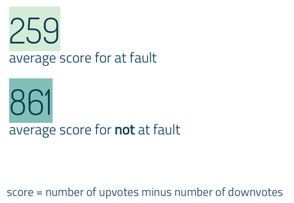
As you can see, my clusters are themselves clustered by gradation: the relatively happy reviews, neutral reviews, and unhappy reviews. Also worth noting is that this analysis was done on five star reviews, so there were less joyful sentiments even about products that were rated highly.

In order to delve further into what these clusters might indicate, I wanted to compare a couple reviews from the sad cluster (leaving aside the sad and disgusted cluster, which is getting at a bit of a different construct) and the very joyful cluster. 

Picture
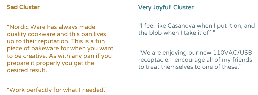
How can we summarize these reviews? 

For the sad cluster, these reviews basically say
"This thing did what I wanted it to do and there is nothing special about it."

On the other hand, for very joyful cluster, the reviews say
"This thing made me feel and experience in a different way."

In the second review for the very joyful cluster, the reviewers are discussing a plug, but there is something about the design of it, the experience of using it, and, in this case, I would assume the convenience of it, that is getting them all excited about the product to the point that they would actually recommend it to others.

One thing we can see here, beyond the fact that experience of a product seems to be at play, is that said experience is also informed by certain components of product design and the ways in which users engage with a product.


A Word on Seasonality

Picture
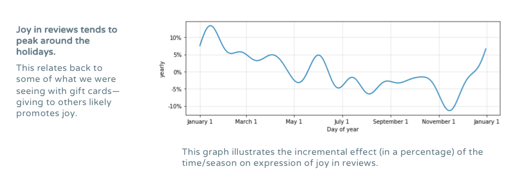
It appears that there is a certain confluence between giving and customer satisfaction as measured through joy. Preliminary topic modeling on reviews also indicated that the very joyful cluster had more language related to giving.

The further implication here is that what a customer actually does with a product matters. It's not just about the function that that product itself has, but about the emotional function the product has for the purchaser. 
​

So What? Why is This Important?

Understanding consumer satisfaction using data that were not directly solicited from customers through surveys can inform UX research, can influence product design, and can contribute to crafting a more robust consumer strategy.

​Consumer satisfaction ​can have all kinds of positive externalities for word-of-mouth advertising, brand image, and even repurchase behavior.

More broadly, the techniques I've illustrated here have broad business applications beyond this context and are likely to add value to any analytic process.
​
Picture
0 Comments

Who is at Fault? Metis Project 4

4/5/2020

0 Comments

 
Picture
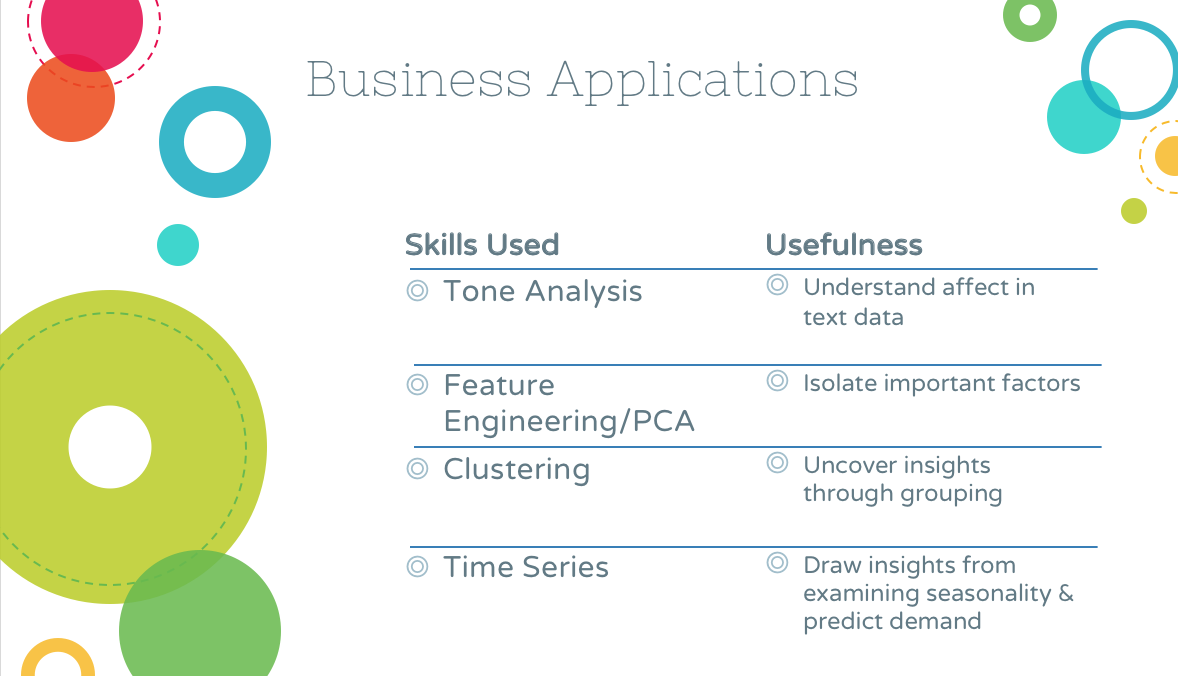
Finally it had come: the project were we were going to use natural language processing (NLP) and I knew I wanted to do something a bit out of the box.

My PhD involved a fair amount of moral psychology work and thinking about what others take offense to cross-culturally. We know some basic things: pretty much every culture is appalled by incest, for example. But what else could we find out?

Because I also worked (in various capacities) at UChicago's Booth School of Business, I knew that teaching soft skills is a serious priority. How can we best get along with others and make sure that group work flows smoothly? Being able to predict when others think we have crossed a line, or better understanding how they might react to our behavior more broadly, could help us to have more fruitful interactions with each other, leading, potentially, to more productivity within business contexts.

Where might I find narratives detailing a moment when someone was unsure of what was his fault? Where could I find crowdsourced determinations of whether that person was at fault?

​REDDIT!

In this project, I sought to answer three questions:
​
1. Under what circumstances are people unsure of whether they’re at fault?
2. How do others respond to those narratives?
3. Can we predict whom others will find at fault?
​

The Data

My data were from a subreddit called Am I the Asshole? or AITA.  This subreddit is often the butt of many a pop culture joke, which gave me all the more reason to take it seriously as a thing to analyze and make sense of.
​
Picture
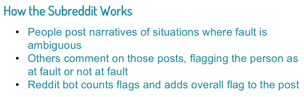
Using the Reddit API, I was able to gather around 800 posts and their comments from AITA. I stored these data in MongoDB.
​

1. When Are We Unsure of Fault?

To answer my first question, I used topic modeling on all of the posts I had. I ended up using a non-negative matrix factorization (NMF) model with a term frequency-inverse document frequency (TF-IDF) matrix. So what topics came up?
Picture
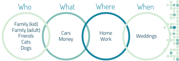
It's interesting to note here is that family (kid) means that you’re the child in the family, family (adult) means that you’re the adult in the family.

Which topics were discussed the most?
Picture
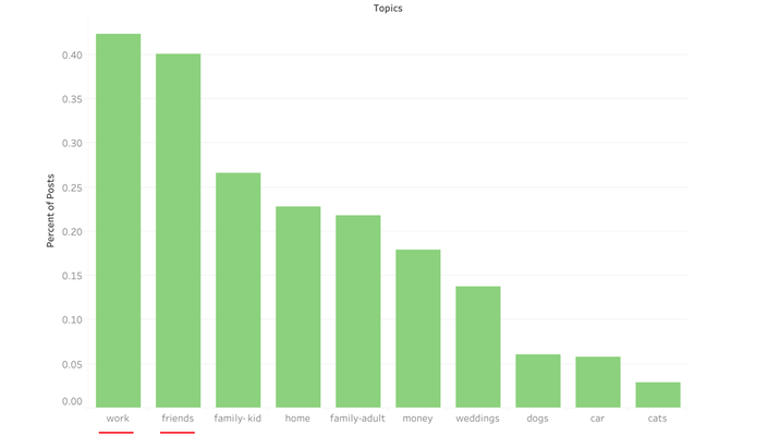
People seem to talk most about work and friends. This makes sense: these are situations where the impression you make likely matters to you. There is a middle level of closeness, as opposed to family who are stuck with you and people you might meet in passing, whom you won’t see again. Instead, these middling levels of knowing someone lead to more need for image management, implying a potentially greater likelihood to second guess one's own behavior.
​

2. How Do Others Respond?

Though people talked the most about work and friends, the most commented-upon topic was, by far, family where the writer is the adult. Secondarily, people also like to comment on posts about weddings and posts related to family where the writer is the child. 

What this possibly means is that other people really have opinions on how one should run one’s family, but people are somewhat less worried about how their actions will be received in their own families. When we tell narratives about our own families, we might not expect that others are evaluating our behavior, but, in fact, they are.

​Something nice here, though, is that while you might be very worried about how your friends and colleagues perceive you and your actions with them, it's possible that they're not really all that worried about it.

Another really nice finding is that the more positive we are, the more positive others are in response: 
Picture
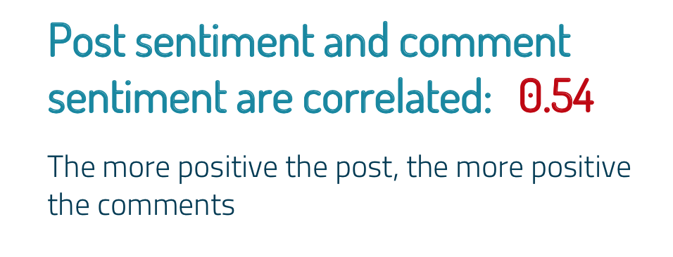
I used TextBlob and IBM Watson's Tone Analyzer to get sentiment (positive, negative) and tone (a range of emotions) for each review. What I found is that peoples' sentiment actually mimic's the sentiment of the post they're responding to. There's been a lot of research on how humans mirror each other-- usually in person-- but this is preliminary evidence that mirroring is occurring both in terms of sentiment and via written text. 

Practically, this is really interesting as a best practice for how we should engage with each other. Though this is just a correlation, it is possible that acting positively inspires others to be positive.


​3. Can We Predict Who is at Fault?

Finally, the question you've all been waiting for! Who is the asshole?! Is it me?!

The short answer is, sadly, no: we can't predict who will be at fault given the data we have. All metrics were similar across people who were deemed assholes and people who were not deemed assholes. A classification model also didn't have much explanatory power. 

If I had to guess, the types of violations, rather than the topics discussed (the people violated), or, perhaps some combination thereof, are what would actually allow us to predict who is deemed at fault. Thus, answering this particular question might require more of a qualitative approach followed by a quantitative one. 

BUT! I did find one difference between people deemed at fault and people deemed not at fault: 
Picture
Among other metrics, the average score indicated that posts where the author was not at fault received more upvotes. 

What I think this means is that people are upvoting or downvoting to flag as "asshole" or "not the asshole" instead of writing their opinion in the comments, which would then be tallied by the Reddit bot.


This might be why people think that this subreddit is full of apologists: you’re more likely to see upvoted posts at the top (due to Reddit's algorithm), and upvoted posts are more likely to be flagged as not at fault.


So what can we conclude about determining fault overall? Topic, sentiment, and tone (emotion) do not signal whether someone is at fault. I do think there is something giving this signal, but that it likely has to do with violations related to autonomy and obligation to others— neither of which was picked up in the metrics used.

0 Comments

Predicting Earthquake Damage: Metis Project 3

4/5/2020

0 Comments

 
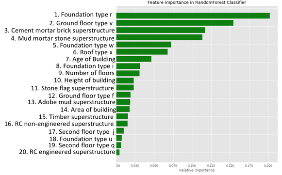
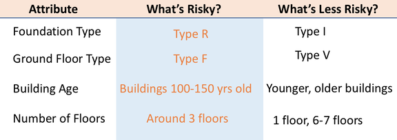
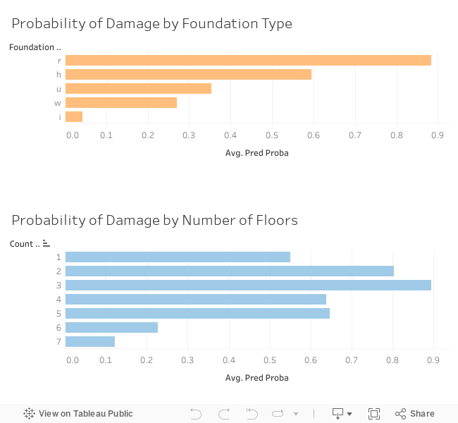
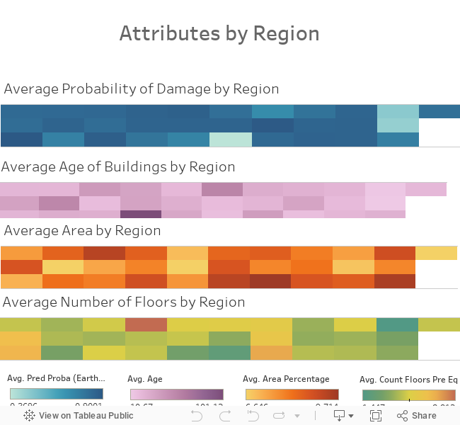
For our classification project at Metis, I chose to look at data from the 2015 Nepal earthquake. While examining these data is important in general, it was also somewhat personal for me: I was in Kolkata at the time of this earthquake and actually felt it. Weeks later, I traveled to a friend's home (where I have been many times) on the border of Nepal.

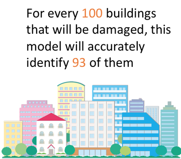
Using data from DrivenData, I was hoping to differentiate buildings that were slightly damaged from those that were extensively damaged. If damage level could be predicted, it would help Nepal to plan ahead and to mitigate future damage in this earthquake-prone region.

Here is a before image of a stupa in Nepal (on the left) and an after image (right). You can see that the earthquake truly was devastating in many locations.

Business Problem

In this analysis, I wanted to address two questions: 
  • What can we do preemptively in order to minimize future earthquake damage?
  • What can we prepare to do reactively when an earthquake inevitably occurs?

The clients I envisioned were an investing company interested in social entrepreneurship and the government of Nepal. The investing company would be interested in supporting industries that could fortify buildings and the government could offer subsidies and incentives for businesses and citizens to build or rebuild using better materials
​

Model

After trying out a variety of classification models (logistic regression, SVM, Naive Bayes, and more), a random forest model was the best at predicting whether a building would be significantly or minimally damaged (as measured by ROC AUC). 

I began with 82 features and, using methods to determine which features were the most important, ended up with a model using 20 features. 
Picture
My model had an accuracy of 0.88, a recall of 0.93, and an ROC AUC of 0.82. In tuning my model, I wanted to prioritize recall, meaning that I would rather label buildings that would not be damaged as if they would be damaged than vice versa. This way, even if a building wouldn't ultimately be significantly damaged in another earthquake, the owners would have prepared as if it would be and would be safe rather than sorry.

A recall of 0.93 also means that...
Picture
Finally, I should also note that though I had geographic data for each building, I didn't use it in my model, because I wanted the model to be generalizable to other earthquakes. Though perhaps damage by region would reflect something specific about fault lines in Nepal, my hope is that my findings would be more widely applicable. Thus, the features in this model relate only to the characteristics of the buildings themselves.
​

Insights

Through looking at different features, I found that foundation type, ground floor type, building age, and number of floors were particularly important in predicting whether a building would be minimally or significantly damaged. Unfortunately, my dataset obfuscated what the specific foundation and ground floor types were, but I was able to discern more specific  information about building age and number of floors.

​"Ave Pred Proba" below refers to the average predicted likelihood of significant damage for that foundation type or number of floors. ​​This interactive visual was made with Tableau.
Picture

Recommendations

Preemptive Recommendations
​

Given what we've found, there's a lot that the investing company and the government of Nepal can do ahead of time to mitigate significant damage in the event of another earthquake. The most impactful thing they could do would be to fix buildings with risky attributes now. Additionally, they could support new builds using less risky materials through subsidies and investments. Further work could be done to determine exactly how risky or not risky a given material might be.

Reactive Recommendations

Of course, you can never plan for all of the damage that might occur, and there might still be a fair amount. What the government can do is to know which regions are particularly at risk. Assuming fault lines would be consistent across earthquakes, some regions would be more likely to be hit than others. My data detailed 31 regions, which are shown below in terms of likelihood of damage.

The first figure shows average likelihood of damage overall by region, the second shows the average age of buildings (which we found to be a relevant feature) by region, the third figure shows the average area of the building by region (larger buildings were more likely to incur damage), and the fourth figure shows the average number of floors by region.

​This interactive visual was made with Tableau.


​I hope to be in or near Nepal again soon. It's a beautiful place at high risk, and is certainly worth striving to preserve.

Here is a view from my friend's house:
Picture
0 Comments

Can Cultural Dimensions Predict Household Spending? Metis Project 2

2/1/2020

0 Comments

 
Weeks two and three at Metis got kind of mathy! Armed with some EDA and data cleaning skills, we jumped into linear regression. While linear regression isn’t always the best model, more often it probably is. It is a powerful tool to make sense of data, and one that is sure to show up again and again.

​

​Business Problem

In linear regression, the goal is to predict the value of some continuous variable for a given observation, or data point. The classic example is predicting a house price given its features. 

While developing my project, I was curious about how households choose to spend their money and what drives those decisions. Is there something inherent about cultural norms that could indicate what a household might be likely to spend its money on?

Understanding this dynamic better could be powerfully informative for companies: which international markets are likely to spend more on education, for example, or innovative food products? Such an understanding could help to inform whether or not a company should enter a new country or whether a company in a given country should expand its offerings and make a new subset of products available.

​

​Background

How does one measure cultural norms? There are several models to choose from, but in this case I chose to use Hofstede’s six cultural dimensions because they’re quantified. 

An example of a cultural norm is individualism versus collectivism. In a country that leans more towards individualism, people define themselves by their qualities and preferences, but in a country that veers towards collectivism, people define themselves through specific relationships with others.

​
Picture

​

​Data Collection and Methods

I combined data from five different sources for this project:

Household spending metrics: 
  • From the UN
  • From the World Bank

Cultural metrics:
  • From Hofstede

Other country metrics:
  • ​From the World Bank​
  • Data on median household income

I collected much of this data through scraping using Selenium and BeautifulSoup and then spent a great deal of time cleaning, converting currencies, and merging my datasets.

​

​Models

When I began modeling, I had many targets and features to choose from:
​

Picture
I chose clothing as my target variable because I had relatively few missing data points and, more importantly, clothing is an interesting metric: it’s a necessity, but is also something people might spend on for other reasons, such as maintaining appearance, as gifts for others, or for leisure. This indicates that there could be more variance between countries for spending on clothing (if it is a priority for a given country for a particular reason) than there would be for something like (unprepared) food, which is more of a baseline need. Through looking at correlations between my target variable and my features, I chose a handful of features to predict spending on clothing. 

Looking at p value to see which features contributed significantly to the model, I figured out which to keep and which to discard. In some cases, where pair plots indicated that I should do so, I used feature engineering to transform features (e.g. log, square root, interaction term) in order to see if those transformations were more predictive. Additionally, I scaled my data (due to high variance) and fit a linear regression model as well as a polynomial model and regularization models lasso and ridge.

After all of that, the model that best fit my data was a basic linear regression and had two features:

  • GDP
  • Population

The adjusted R^2 value, which measures the proportion of variance explained by the features (and which is adjusted for number of features), was 0.86, which is relatively high (closer to 1 is better), but my root mean squared error was 1.5 billion, which is also high given that the average of my target variable was 2.8 billion. Despite attempts, regularization and other efforts did not decrease this error; it appears that there was high variance in the data to begin with. Additionally, there are only so many countries in the world, so I had fewer data points to test on than would have been ideal.

So what does this mean? It makes sense that GDP and population would correspond to how much households spend on clothing. What this basically indicates is that macroeconomics was correct: spending is proportional to how much money people have, and, in this case, more people means more spending.

I wanted to look at another model to see if I could get a better look at what might contribute to one country spending more on clothing than another country would spend. For this model, my target variable was spend on clothing divided by total spend, such that for each country had a proportion of how much was spent on clothing (relative to other spending) rather than just a sheer dollar amount. 

After some modeling and feature engineering, I ended up with a linear regression showing that two cultural dimensions, long-term orientation and masculinity, contributed to predicting proportion of spend on clothing. Long-term orientation was positively correlated, but masculinity was negatively correlated, meaning that as masculinity went down, proportion spend on clothing went up. I should note here that I don’t think the word “masculinity” accurately represents the metric in question, so I’ve re-termed it as competition-orientation and its opposite as consensus-orientation for my purposes. For my model, this means that as consensus-orientation went up, so did the proportion of spending on clothing. Here are my descriptions of these cultural dimensions:

Picture
Though my root mean squared error for this model was low, so was my adjusted R^2 at 0.15. In this model, the intercept term was significant in the model, likely indicating that there is a baseline proportion of income that households spend on clothing, or, in other words, there is little variation.That said, these two cultural dimensions did seem to contribute to that variation. 

Why these two cultural dimensions contributed to proportion of spend on clothing is somewhat obfuscated. It seems likely that focus on quality of life in the consensus-orientation could correlate with prioritization of having nice things and, thus, with an increase in spending on clothing. More granular data about the countries in question and more specific spending data could elucidate this connection, as well as a potential link with long-term orientation.

​

Conclusion

I would advise a clothing company looking to expand to a new market to consider the long-term orientation and consensus-orientation of that market as metrics that might affect their decision. Additionally, I would advise a company already in a market high in long-term orientation and/or consensus-orientation to look into the market for clothing and whether they might want to create new lines or expand existing offerings. In both cases, I would advise that the company take into account whether the net margins of such a move would be beneficial, depending on predicted spend values, given that those are correlated with GDP and population, which might be more consequential deciding factors.
0 Comments

Using MTA Turnstile Data to Strategize Gala Promotion: Metis Project 1

1/12/2020

0 Comments

 
My first week at Metis could certainly be described as a whirlwind. Making use of all the angst and excitement that come with using new skills, I eagerly dove into our first project. We used Python, Pandas, Seaborn, and more to perform an exploratory data analysis, always keeping our framing questions in mind.

​

Framing the Project

​The premise of the project that we were approached by a (fictitious) client: WomenTechWomenYes (WTWY).  Our clients provided us with the following information:
​

As we mentioned, we are interested in harnessing the power of data and analytics to optimize the effectiveness of our street team work, which is a significant portion of our fundraising efforts.
WomenTechWomenYes (WTWY) has an annual gala at the beginning of the summer each year. As we are new and inclusive organization, we try to do double duty with the gala both to fill our event space with individuals passionate about increasing the participation of women in technology, and to concurrently build awareness and reach.
To this end we place street teams at entrances to subway stations. The street teams collect email addresses and those who sign up are sent free tickets to our gala.
Where we’d like to solicit your engagement is to use MTA subway data, which as I’m sure you know is available freely from the city, to help us optimize the placement of our street teams, such that we can gather the most signatures, ideally from those who will attend the gala and contribute to our cause.
​

I’ve added some emphasis in bold. These phrases helped us to frame our project and to design a pipeline which would best address our client’s needs.

Primary Goal: To effectively place WTWY’s street team in order to…
  • Maximize attendance (“build awareness and reach,” “gather the most signatures”)
  • Target attendees who will…
    1. Be interested in the mission of WTWY (“will attend the gala,” “passionate about increasing the participation of women in technology”)
    2. Contribute to the cause (“fundraising efforts,” “contribute to our cause”)

So where should we put the street team?!


Designing our Approach

Picture

First, we had to make a few assumptions:

  1. Prioritizing the highest traffic subway stations would maximize the number of emails collected
  2. We pulled data from May 2019, assuming that:
    1. These data would be similar to May 2020 and
    2. WTWY will be collecting emails a month before the gala date, which we decided would be in June 2020
  3. People in the demographics we choose to target are, in fact, people who are interested in WTWY and its mission.
  4. There are a whole lot of interesting ways to combine entry and exit data. Since we chose to prioritize sheer volume rather than patterns of traffic, we assumed that entry counts were a sufficient data source for our purposes.

Given the client’s goals and these assumptions, we chose to focus on finding most trafficked stations using MTA turnstiles data and to look at demographics using data from ZipAtlas.

​

Data Process and Pipeline

Picture

We followed this process for the datasets we used.


MTA turnstile data is collected at every NYC subway station every four hours and for every turnstile. The data are available online, making it easy for anyone who is interested to check them out (acquire). After we acquired these data, we needed to clean them; this included getting rid of white space in column names, dropping entries where the turnstile counter malfunctioned, and, most importantly, making sure we could actually use the entry tallies (transform). Apparently, these turnstiles had been cumulatively tallying up entries (since… the beginning of time?), and we needed to create a new column with daily counts in order to use these data in a meaningful way.

Data used for demographics was primarily from ZipAtlas, which provides the following metrics;
  • Percent of females in the labor force by zip code (likely interested in WTWY’s values)
  • Percent of people who take public transit by zip code (likely to be using the subway)
  • Percent of people in professional and scientific jobs by zip code (likely interested in WTWY’s values)
  • Percent of households with an income over $100k per zip code (able to donate)
  • Population (likely to attend, since they live in NYC)
We acquired these data from their site. Cleaning these data wasn’t too hard-- just eliminating some symbols (e.g. %) and making that all of the columns were in the correct data types. However, we soon realized that we had all this demographic info by zip code, but did not have zip codes for the subway stations! The MTA helpfully provides another site with the coordinates of each station, so we were able to determine their zip codes using a package called uszipcode. Then we merged the two dataframes together (transform).

So now that we had all the data figured out, what did we learn from it?

​

Exploration and Analysis

Maximizing Volume of Potential Attendees

Picture
First, we found that the most stations trafficked most on a daily basis (on average), were 42nd St Bryant Park, 14th St- Union Square, Times Sq- 42nd St, 34th St- Penn Station, 42nd St- Port Authority, and Canal Street. Ok, great. So are these stations more trafficked on any particular day of the week?
Picture
It looks like these stations get more traffic on the weekdays, a trend which held for all of the stations. 

These stations look pretty much the same for entries in the morning and exits in the evening, so it looks like commuters are probably frequently using these stations (and, likely, ones from outside of NYC). 
Picture
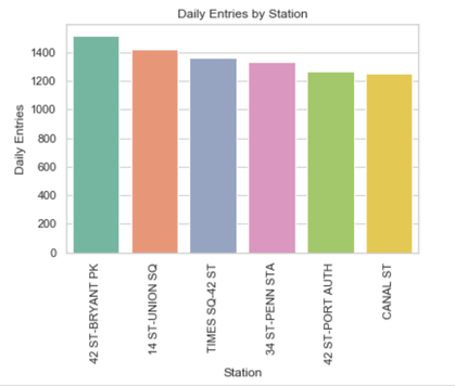
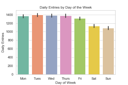
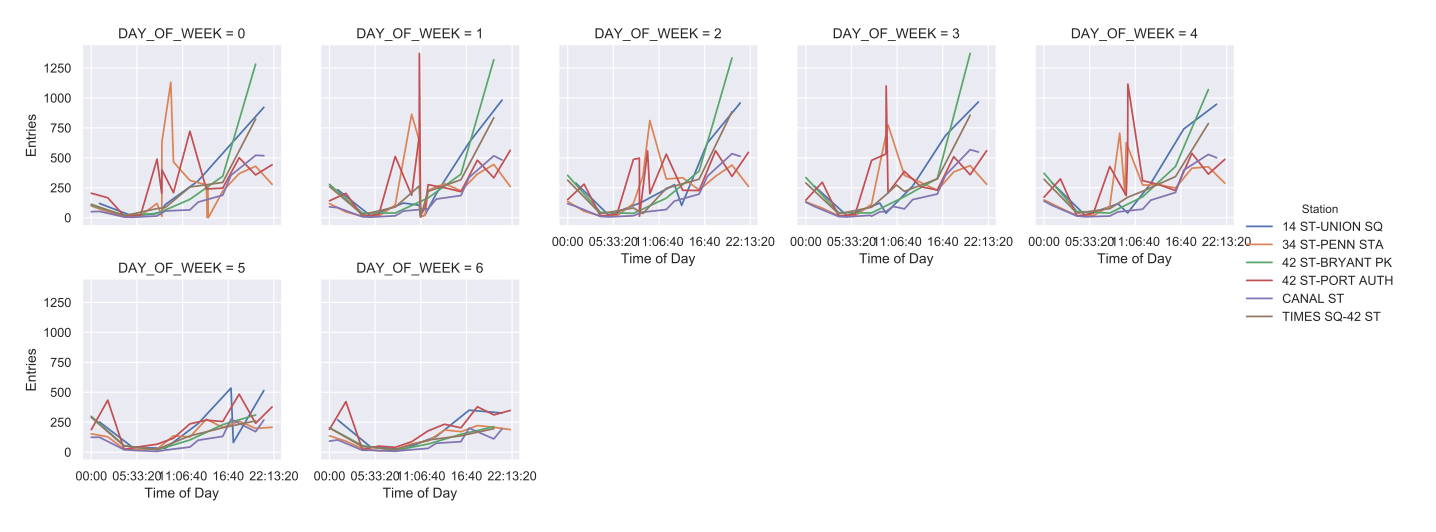
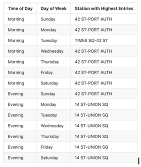
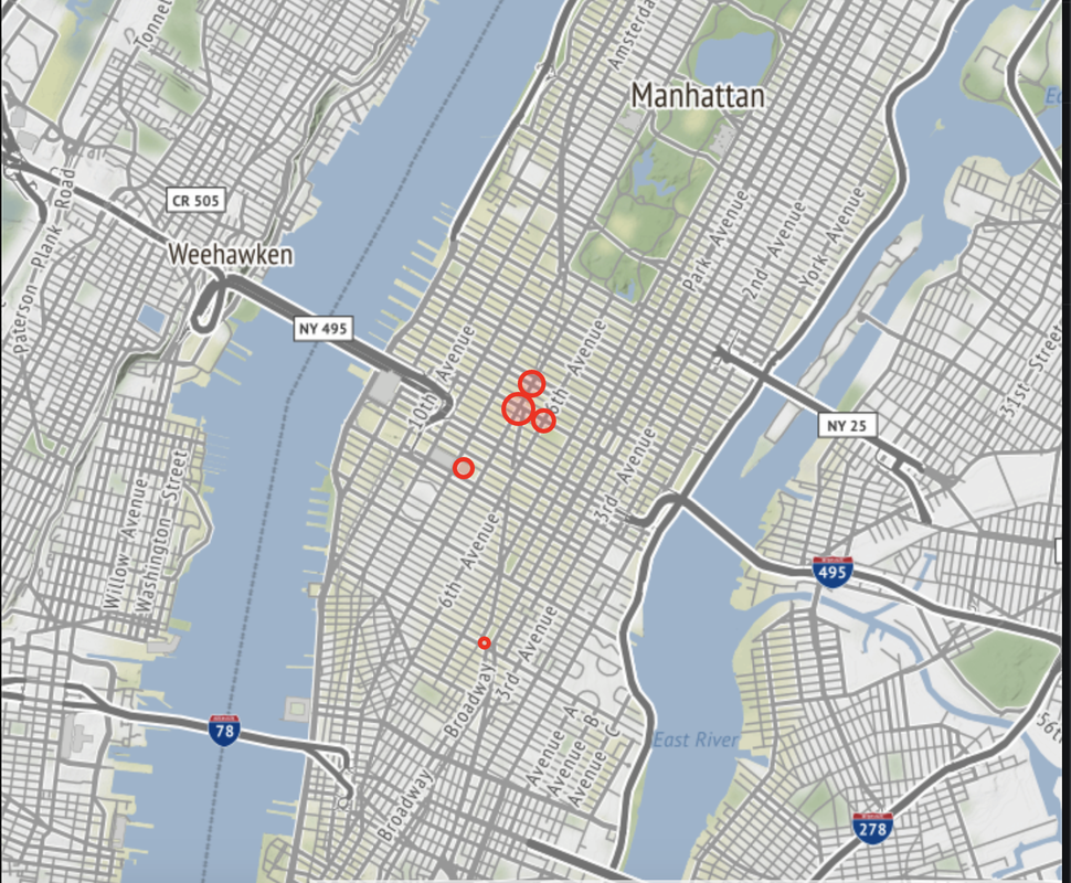
Entries During the Day
Picture
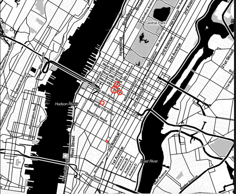
Exits in the Evening

​Okay, great. We can tell WTWY to station their crews at these stations during the week. But at what times would they catch the most people?
​

Picture

Here are entries for each day of the week (0 = Monday and so on). Note: though these lines look continuous, the data were only gathered every four hours, so they’re not. Still, this is a great visual way to represent some of what is going on at these stations. We can see that Port Authority and Penn Station seem to spike earlier in the day on weekdays (when people head to work) while Bryant Park and Union Square spike later in the day (perhaps as people are headed home).


Given our data, here is a time schedule we’d recommend:
​
Picture


​Prioritizing Demographics of Potential Attendees

We pulled data for five metrics from ZipAtlas-- females in the laborforce, taking public transit, having professional or scientific jobs, household income over $100k, and population-- but is each of these metrics equally important for our analysis? 

To find this out, we plotted out histograms of these data by zip code:

​
Picture
Picture

​As you can see, the two metrics -- household income over $100k and population-- have far more variance. What does this mean practically? Well, if WTWY prioritizes stations in zip codes with relatively high populations of females in the laborforce, populations frequenting those stations are still pretty similar to stations in zip codes with relatively low populations of females in the workforce. In other words, the data is pretty homogeneous. However, there’s a bigger difference in demographics between a station in a zip code with relatively high rates of household income over $100k and a station that is relatively low on that metric. Put simply: WTWY gets more bang for its buck, and probably hits its target groups more effectively, by focusing on stations in zip codes with relatively high rates of household income over $100k and higher populations.

A word about why population is important here: just because a station is highly trafficked (as are the ones mentioned above), this doesn’t mean it’s trafficked by the kind of people you want to target. In this case, the most trafficked stations are in areas that 1) have a lot of tourists and 2) have train lines, so a lot of people are commuting in from Connecticut and New Jersey to go to work and entering the subway (as opposed to exiting) at these stations. These people may be less likely to come into the city for a gala. This is an argument to use population as a metric, hopefully targeting people who actually live in the city and might be more likely to attend a gala.

Here are the stations highest on the metrics of household income over $100k and population:
​

Picture
Picture

​Based on these data, and cross-referencing these stations with entry data (by looking at percentile), as well as making sure that these stations represent neighborhoods that have favorable demographics, the following stations are all around good bets:
  • Grand St
  • 103 St 
  • 72nd St
  • 96th St
  • 2nd Ave
  • 86th St

Conclusions & Recommendations

Given our analyses, we can draw the following conclusions and make the following recommendations to WTWY:

Conclusions:

Volume:
  1. The most trafficked stations seem to be in commuter areas.
  2. Travel on the weekdays is relatively comparable; travel on weekends is relatively low.
  3. The busiest times are when people are coming to and leaving from work.

Demographics:
  1. Stationing street teams at subway stations is probably an effective way to target people with household incomes over $100k, who are more likely to donate, and to target people who actually live in NYC, and, therefore, might be more likely to attend.
  2. There might be better ways to target women and tech workers, whose values would likely align with WTWY’s values, than stationing street teams at subway stations, given the relative demographic homogeneity across the city. And hey, WTWY, we’re happy to analyze some other data to figure out how to reach them! You know how to find us. 

Recommendations:

Volume: 
If WTWY chooses to prioritize getting to the most people, they should put their crews at the six subway stations listed above at the times recommended.

Demographics:

If WTWY chooses to forego reaching quite as many people, but, rather to reach people who are likely New Yorkers and who likely have the means to donate, they should prioritize the six stations recommended above.

​
*Icon attributions: people by Wilson Joseph from the Noun Project- Demographic Data by H Alberto Gongora from the Noun Project
0 Comments

Coming soon!

3/23/2019

1 Comment

 
As I get the rest of this site together, I'm coming up with ideas for this blog. Check back soon to see what I write!
1 Comment

    Author

    Rita Biagioli

    Archives

    May 2020
    April 2020
    February 2020
    January 2020
    March 2019

    Categories

    All

    RSS Feed

Powered by Create your own unique website with customizable templates.